
DESIGN THAT INCLUDES: V&A’s DESIGN AND DISABILITY EXHIBITION
An overview of our findings from the V&A exhibition Design and Disability, and how we all can implement accessibility-first thinking to create inclusive design.
1 in 6 people have a disability in the UK, so incorporating accessibility-first thinking into design has never been more important.
One of the biggest challenges designers face is remembering to design for the audience, not for ourselves. When serving vulnerable communities such as people with disabilities, that principle becomes critical – which is why a group of Outlaws took a trip to the Design & Disability exhibition at the V&A.
Our field trip was a deliberate pause from day-to-day work – a chance to seek inspiration and reflect on how design shapes, and is shaped by, the lived experience of disability. Most importantly, it was a reminder that the things we make – the products, services, and systems we contribute to – always intersect with real lives.
Pastel-coloured walls, lowered lighting, and tucked-away rooms create an immediate sense of calm. Not the stiff hush of a gallery, but a relaxed, spacious quiet that invites you to slow down. Exhibition materials are available in large type, audio, braille, and tactile formats - and it’s immediately clear that care has been taken to make this an inclusive space and experience.
From our learnings, we can ask ourselves - what can brands and designers do to become more inclusive in their designs?

01 Visibility as Resistance
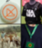
The exhibition’s first section focuses on visibility, on how disabled people have historically been made invisible, and how they’ve challenged that invisibility through design, fashion, art, photography, protest, and zine culture.
What stands out is how many of the works use humour, colour, and spectacle not to soften disability, but to express it in full force. Drag performers, carnival costumes, wearable tech that defies convention - each piece speaks to identity, ownership, and pride. Disabled designers aren’t “represented” here, they’re the creators.

02 Tools, Hacking and Everyday Innovation
The second section, Tools, explores the creativity and pragmatism of disabled people adapting the designed world around them, often out of necessity.
There’s a hacked eyeliner holder. A silicone cutlery grip that outperforms a high-tech prosthetic. The Xbox Adaptive Controller, an inclusive design born from real user input. These aren’t high-concept artefacts. They’re simple, clever, and deeply effective. They challenge the idea that design innovation comes only from labs or studios.
This section also raises an uncomfortable truth: disabled people are too often left out of the design process, despite being experts in their own needs. Instead of being consulted, they’re forced to work around, to ‘hack’ products or environments to function at all. It’s a provocation we need to hear. Especially in brand and product design, where “usercentric” can too easily become a superficial label. Real inclusion means co-creation, not just user testing.

03
Disability Is Not a Monolith
Another crucial point the exhibition makes: disability isn’t a single, unified experience. It intersects with gender, race, class, and queerness. The show makes space for this complexity - pushing back against the media and branding tendency to generalise or simplify.
This has major implications for how we communicate. Messaging aimed at “disabled people” can easily flatten nuance if it’s not grounded in real listening. We need to resist the urge to treat any group as a demographic block. Inclusive design must be specific, plural, and responsive.

04 Designing for the World We Want
The final section, Living, looks at how disabled communities have imagined and built the worlds they want through protest, solidarity, artistic intervention, and speculative design. There’s a deep thread of activism here, from the Anti-Stairs Club to Camp Jened, a 1970s summer camp for disabled teenagers (as featured in the documentary Crip Camp).
One video installation captures daily life at the camp: kids laughing, playing, messing about - totally ordinary, and that’s the point. One boy speaks candidly about the shame of wearing diapers due to incontinence, and how he tried to hide it from his friends.
That moment hit particularly hard for us, given our work with a global leader in continence care. It was a rare, clear-eyed glimpse into the emotional reality behind a “user need.” A reminder that we’re not designing for personas, we’re designing for people, with full lives, private struggles, agency, humour, and contradictions.
05 What We Took Away
In our work, the human side of design is easy to lose in the churn of
deliverables, deadlines, and briefs.
But this exhibition forced us to ask bigger questions:
Are we designing for dignity, not just distinction?
Are we speaking in ways that welcome, not assume?
Are we building brands that don’t just look good — but do good?
Design and Disability showed that inclusive design isn’t a niche discipline — it’s just good design. Grounded, inventive, sometimes messy, and always deeply human.
As brand designers, it’s our job to reflect the world as it really is — and to imagine how it could be better. This exhibition reminded us what it looks like when design starts in the right place: with people.

06 What Does This Mean for Packaging Design and Brands?
When it comes to branding and packaging, we should focus on creating design that works for everyone, not just those with specific needs.
Considering these principles will help us to break down barriers in accessibility when it comes to branding and packaging:
Make Information Clear
Use plain language, a strong typographic hierarchy, legibile typography size and high contrast colours. Consider placing a NaviLens symbol onto your packaging to ensure your brand is easy to navigate on shelf.
Consider Ergonomics
Incorporating easy open or ergonomic packaging design, and including tactile print effects for a sensory experience.
Design for All
Ensure customers living with disabilities are considered at every design stage to create an equitable design system.
